How to Plan Travel During a Pandemic
A new feature displaying the latest official COVID-19 travel restrictions at each stage of the trip.
Problem
Overnight, pre-COVID travel routines were replaced with a patchwork of conflicting rules that changed at every state and country border. Official COVID-19 restrictions shifted regularly — often with little warning. Amid this disorganization, travelers were left to hunt for relevant information from the local health authority at every stage of the trip. At that time, there was no centralized resource for travelers of up-to-date information covering every city, state and country jurisdiction.
TripIt users needed curated, digestible and timely information from the relevant healthcare authorities about traveling safely during a global pandemic.
How might we make checking COVID-19 travel restrictions as easy as checking flight times?
Process
No one knew how quickly travel bookings would recover. When air travel began to rebound in the summer of 2020, there was little time to conduct formal user research and still ship a product in time to help TripIt’s users.
In response to the accelerated timeline, I embarked on guerilla internal user research that included Slack polls and card sorts with industry experts within Tripit. The insights I gathered shaped the initial information architecture.

On the content side, there was a lot of data to wrangle from our third-party provider of COVID-19 travel restriction data. I worked closely with the product team to analyze the source API and build a matrix of different API values that needed to be displayed. Those values included binary values, numerical values, and strings of data that ranged from a few sentences to multiple paragraphs.
Finding a way to easily display these vastly different values was a significant challenge. We converted those values into user-friendly copy that would eventually display in the UI. When it came time for development, the engineering team was extremely grateful for the matrix I created.
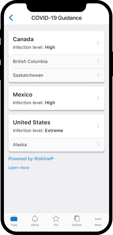
We also identified a significant hierarchy issue early in conception. While the data was structured by country for the majority of cases, five countries (including the US) also offered data at a regional level. This didn’t fit within TripIt’s existing hierarchy. To solve this problem, I introduced a new card component to the design system that naturally grouped items like regions within countries together. Below are initial wireframes that show destination selection and data while using existing patterns and components in the TripIt app.
Throughout the design process, I shared my work regularly with the other designers on the team during our review sessions. While each designer manages their projects, asking for regular feedback from the team helps me take a step back and see my decisions through another designer’s eyes, catch visual inconsistencies, and gain perspective on my work. Sharing designs at a regular cadence is part of my approach to design.
Solution
The final product was a guidebook that consolidated COVID-19 risk data into a digestible format within the app. Users wouldn’t have to rely on Google and pour over government websites to find the latest travel restrictions. Instead, once a user books a trip, they can easily see the latest COVID-19 guidelines and infection data for the destinations they’re visiting.

Following the initial launch of this feature, we added data regarding airlines’ specific travel policies and restrictions. This new screen contained a summary string, relevant links, and a list of binary options around pandemic flight information.
As part of this project, I introduced a new card component and layout to the design system that solved the problem of varying data string lengths coming from the API. This card component provides a way to separate and sort data while offering the flexibility to display multiple heights.
In the Country/Region selection, a card represents a single country, with rows of regions listed when applicable. Destination screens emphasize the most important information for each category card, with additional information behind a “Learn more” CTA. The cards that I designed for this project live on as components available in the design system for designers to use in other applications.

In the following quarter, I worked on a responsive web version of COVID-19 Guidance. This work included a high level summary along the trip itinerary that exists in the right rail to give users COVID planning information. The summary includes, vaccination exemptions, testing requirements, quarantine requirements, airline certification, and a link to a dashboard with more details.
The web dashboard displays similar information as mobile screens. The controls within each card allow it to expand with more info. Expanding a second card minimizes the first card, as to not overload the user.
Press


.png)
